The graph below shows the changes in the birth rates for women in 6 different age groups in the UK from 1973 to 2008.

Mở bài
Để viết được mở bài ta sẽ paraphrase lại đề bài.
The graph below shows the changes in the birth rates for women in 6 different age groups in the UK from 1973 to 2008.
-> The line graph compares fertility rates across six age brackets in the United Kingdom between 1973 and 2008.
Tổng quan
Để viết được phần tổng quan ta cần nhìn tổng thể biểu đồ và chọn ra những đặc điểm nổi bật nhất. Vậy đâu mới là đặc điểm nổi bật nhất? Đối với Line graph, ta sẽ hỏi mình các câu hỏi:
- Xu hướng chung của các đường là gì? (tăng/giảm/dao động/giữ ổn định, …)
- Đường luôn cao nhất/thấp nhất?
- Đường mang kiểu hình khác biệt nhất với các đường còn lại?
- …
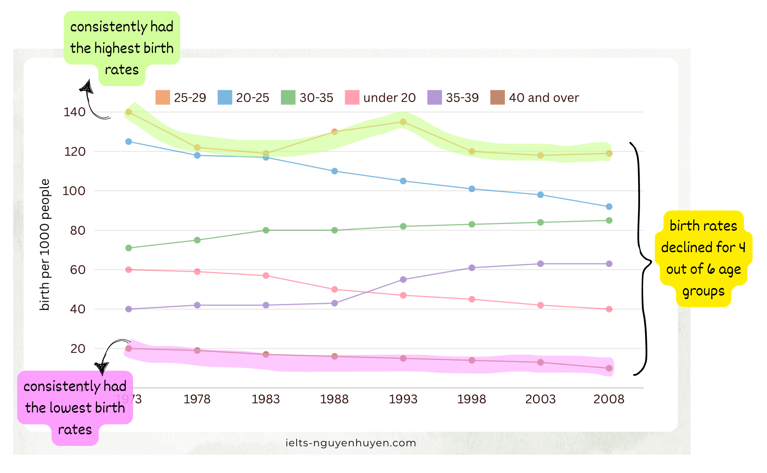
Với biểu đồ này ta thấy:
- Trong 6 nhóm tuổi thì tỷ lệ sinh ở 4 nhóm giảm, 2 nhóm tăng
- Tỷ lệ sinh của nhóm 25-29 luôn cao nhất
- Tỷ lệ sinh của nhóm
Từ đây ta có Tổng quan như sau: Overall, birth rates declined for four out of six age groups. While the highest birth rate was recorded for women aged 25 to 29, the rate for the 40 plus age group remained the lowest throughout the period.
Thân bài
In 1973, the birth rate for those between the ages of 25 and 29 stood at 140 births per 1000 women. After experiencing some ups and downs, it ended at just below 120 births in 2008. People aged 40 or over consistently had the lowest birth rate, starting at only 20 births per 1000 in 1973 and falling gradually to about 10 in 2008. During the same period, birth rates for women aged under 20 and those aged 20 to 25 also saw a decline, from 60 births per 1000 women to around 40, and from roughly 125 to around 92 respectively.
The remaining age groups followed a completely different pattern, with birth rates witnessing an upward trend. Birth rates for the 35-39 age group were lower than that of the 30-35 age cohort, but saw a bigger jump, from about 40 to roughly 62, while the rate for the latter rose more slowly, from around 70 to nearly 83.
Bài mẫu
Dưới đây là phần bài mẫu với từ vựng hay được in đậm.
The line graph compares fertility rates across six age brackets in the United Kingdom between 1973 and 2008. Overall, birth rates declined for four out of six age groups. While the highest birth rate was recorded for women aged 25 to 29, the rate for the 40 plus age group remained the lowest throughout the period.
In 1973, the birth rate for those between the ages of 25 and 29 stood at 140 births per 1000 women. After experiencing some ups and downs, it ended at just below 120 births in 2008. People aged 40 or over consistently had the lowest birth rate, starting at only 20 births per 1000 in 1973 and falling gradually to about 10 in 2008. During the same period, birth rates for women aged under 20 and those aged 20 to 25 also saw a decline, from 60 births per 1000 women to around 40, and from roughly 125 to around 92 respectively.
The remaining age groups followed a completely different pattern, with birth rates witnessing an upward trend. Birth rates for the 35-39 age group were lower than that of the 30-35 age cohort, but saw a bigger jump, from about 40 to roughly 62, while the rate for the latter rose more slowly, from around 70 to nearly 83.
Khóa học IELTS Writing Online
Nếu bạn đang cần một khóa học IELTS Writing Online dạy chi tiết từng dạng bài trong cả hai Task, bạn có thể tham khảo khóa học của Huyền tại đây nhé.